Monday, 15 February 2016

Looking at house styles

Through time, stop frame animation has spawned many ‘house styles’. Despite sharing the same fundamental process, these styles are very distinctive in both their appearance and overall feel. The methods in which these types of animation are created and the assets used also differ from one another. I intend to research and mimic some of these styles before choosing one in which to create my final piece.

Whiteboard

Below are some examples of whiteboard animations.
Original titles:
-Stop Motion | Whiteboard Animation: The Marker Maker
-a whiteboard animation proj001

Observations:
Assets used
-Obviously both animations make use of a whiteboard, other assets include a black marker and the animators hands. The black marker may be used because of the strong contrast it has with the white background, making the drawings more visible. The bold lines also match the very cartoonish elements found in both animations. The animators using their hands adds a 3D quality to what would otherwise be a 2D animation, this is effective because it makes the process seem more tangible (it efficiently communicates the idea that the animation is made using a whiteboard). A camera and lighting were also required for the making of these animations.
-
How it was shot
-Both seem to have a camera in a fixed position so the animation can flow as smooth as possible without any jittering, they may have even had a remote so touching the camera wouldn’t have been required. Lighting would also have to remain stationary and consistent as well as the whiteboard itself. having these elements in place before shooting is essential because it removes the likelihood of a mistake and can let the animators focus primarily on the drawing.
-Both animations were able to incorporate sound into their narrative, this means the animators would have had to consider syncing audio.
-
Aesthetics
-Very cartoonish and surreal visuals which are effective because of the freedom of 2D drawing. This also means it is easy to transition between styles in a smooth and natural way.
-One of its main strengths is the minimal style in terms of colour, the black on white stands out and easily focuses the viewers attention as there are no other assets or objects to distract.

-Can blend both 2D and 3D making the style quite unique. This also adds a sense of tangibility.
Replicating Whiteboard style

Equipment used


When replicating the whiteboard animation style I worked in a group with two others.
Choices made
-Our setup was very similar to the videos I have already reviewed , containing many of the same assets. These included a whiteboard, marker pens, a camera, a tripod, and a remote for the camera. The whiteboard and camera were fixed into position to avoid unwanted movement and the lighting used was the basic room lighting. As all whiteboard animations must be composed of the same basic elements there was little we could do to differentiate from the videos we saw before hand other than change marker colours. I have found what defines one animation to another using this style is its content rather than setup.
-
Changes made to colour scheme and background
-As stated before there was very little that can be changed when making a whiteboard animation. We decided to use three different colours of marker rather than one, this allowed each artist to focus on their own part of the animation without affecting another's work. This was also a good opportunity to see how colours other than black show up against the white background.


Comparison
-After putting together our animation and viewing it, I have found very clear differences compared to the original videos I reviewed. Firstly our animation was created in 2 hours meaning ours couldn’t be as long as the others, which likely took a lot longer to put together. The red and blue markers used clearly show up on the white board but don’t make the same impact as the black on white. I noticed that the room lighting though consistent is much dimmer than expected making the whiteboard more grey than white. This is important because had the whiteboard been better lit the markers may have made a stronger contrast and therefore stood out more, in the other videos they clearly have light shining much more intensely at their whiteboards. 

Zoetrope

Below are examples of zoetrope animations.


Original titles:

-Melting POP © Alexandre DUBOSC
-Hawk zoetrope


Observations:
Assets used
-Unlike animation as we know it today zoetropes predate film animation and use a clever method of rotating multiple still images then impeding the viewers vision with an outer cylinder with slits, to create the illusion of movement. The examples I have picked out are very different in terms of assets and style but are fundamentally the same form of animation.  The first video is a 3D model of what looks to be a cake, in keeping with that theme all the animated details are either made of chocolate or are in some way food related, such as the popcorn and coffee. Even when animated the characters appear to be eating which further connects the aesthetical look to the subject of the animation. The second video is a lot less elaborate and is more traditional in terms of what a zoetrope is. The only assets used are the still images of a hawk, lighting and a rotating mechanism. The minimalistic black & white design matches the sombre movement of the hawk.
How it was shot
-The first video was shot quite dynamically, giving the viewer the opportunity to examine each feature of the model in detail. As the model didn’t have the same outer cylinder like traditional zoetropes, it is likely the animator made slight rotations and took photos with each movement thus making it a stop frame animation. Like the whiteboard animations before, it had consistent studio lighting and a still camera to make the animation look as smooth as possible. The second video was shot not as an animation, but someone viewing an animation. It gave a good look into how a zoetrope actually works, this is because the camera operator looks at it from an angle with and without the cylinder. Though this video was not a set up animation it does give a good perspective on how animation works.
-
Aesthetics
-Effective for showing multiple movements at the same time
-As stated before the first video keeps the theme of food and relates the action of the animation with the overall aesthetic seamlessly. The bright colours also compliment the silly playful nature of the animation.
-The second is fittingly dark and quiet which matches the hawk and its movements well.  


Replicating zoetrope style


Equipment used


Choices made
-Like the first video I saw, I intended to create a 3D zoetrope animation. Unfortunately I was unable to make a fully functioning, rotating model because of time constraints, however I was able to effectively replicate how the animation style works using play dough. Rather than slowly moving the model like Claymation I crafted five separate models to individually take pictures of, this was done because it accurately mimics what a zoetrope does. Play dough was used because it is a relatively easy substance to mould.
-My animation was intended to focus more so on the process of replicating the zoetrope style rather than capturing a particular aesthetical look. Therefore the models crafted are quite simplistic in design. There was also a marker placed within the frame so I knew where to place the next sequential model, this is because otherwise the models might have awkwardly jumped around the frame rather than sit in place.
-
Changes made to colour scheme and background
-As yellow play dough was all that was at my disposal, colour alteration wasn’t really an option. However my only intention was to capture a smooth animation therefore the colour of the play dough made little difference. For the background I used a white sheet of paper. This was to keep consistency and potentially capture the lighting better, though once again I was relying on the basic room lights.


Comparison
-There were a great many differences in the process of creating my animations in comparison to those I viewed before hand.
-I did not have the same equipment found in the first video such as a rotating model and appropriate lighting. Therefore my animations seem severally limited in comparison. The lack of good lighting makes the videos appear quite dark.
-My models didn’t take on a particular aesthetic however my second animation of the moving lips may well have been influenced by the first videos eating movements.
-I did not take dynamic shots as the first video had, once again this is because I did not have as many animated objects to feature though I could have shot the same objects from different angles.
-Sound was also incorporated into the first video which was synced and fit the actions of the animation. This wasn’t possible for mine as all my animations are put into a gif format.
-
Split pin

Below are examples of split pin animations


Original titles:
-Split Pin Olympics.m4v
-work in progress- puppet animations for music tech gig

Observations:
Assets used
-The split pin animations I have seen are simple in their design using very basic materials. Other than the camera setup and lighting the only other objects included are the split pin figures themselves and a background. The first video takes on an Olympic theme, so the figures are given an athletic design with different national flags serving as a background. The second is more illustrative only having a single designed character and background but they maintain the same aesthetic.
-
How it was shot
-Similarly to the whiteboard animations, these split pin styles use a stationary camera so the animators main focus is on the movement of the figures. As the figures are likely made from paper or card they wouldn’t be able to support themselves, this means the only way to capture this animation style is with aerial shots and laying the characters on the ground. The figures are made with pins attaching their limbs, these act as pivot points where the limbs can be adjusted when necessary. Like the puppet animations earlier, it is likely this style is most effective when accurately replicating real actions, incorporating weight and exaggeration to the movements of the figures.
-
Aesthetics
-The first animation as stated before takes on a sport theme, as the split pin figures are close representations of people and how our limbs work, it seems appropriate to animate them with this aesthetical take on the style.
-The main strength of this animation style comes from the characters movements.


Replicating split pin style

Equipment used


Choices made
-The camera was placed on a tripod and aimed directly down so I could lay my split pin figure on the ground as was likely the case in the other videos.
-My split pin model was designed to look human, to prove I could replicate a style and new how to proportion a character.
-I chose to make the character walk to show I could make movements appear fluid.
-
Changes to colour scheme and background
-Split pin figure was built from paper so I chose not to place it against a white background because the movements would not have been visible. Fortunately the floor was dark enough to make a strong contrast with the character.


Comparison
-The movements of the figure are smooth but very awkward. Its actions slightly represent walking but the figures body doesn’t actually move from its position, which makes it look more like its struggling. Despite the other videos fairly slow frame rates, the figures moved with purpose and it was clear what they were doing.
-The other videos were clearly themed, and even though this is a test animation it does lack the character that the others have. Just by adding some colour or a designed background I could have made the character move with a certain intent.


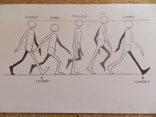
To improve upon my previous animation I took guidance from other sources which gave clear instruction on how to effectively mimic a walk cycle. By following diagram as illustrated below I revised and reshot my walking split pin figure. To learn from my earlier errors I also gave the figure a base on which to walk, because it adds context to the animation so the figure no longer looks as if its moving in empty space.


Wire puppet animation

Below are examples of animations using a puppet
Original titles:
-Kevin Parry - The Artic Circle (stop motion animation)
-Ausbruch (stop-motion puppet animation)
-
Observations:
Assets used
-In comparison to those I have already seen, this style of animation appears much more elaborate in both its concept and execution. Both videos had a main puppet character which were the focus of the narrative. The first video had a stylised set in which the story took place so many of the props were well designed such as the tree, fruit and odd metal chamber. The second had a much more shoddy/rustic appearance not to the videos discredit. The props were very clearly constructed from primarily cardboard as well as other scrap materials like string.
-
How it was shot
-As the puppets are the main focus, the animations are shot to follow what these characters do. Unlike whiteboard animations which mainly feature 2D imagery, these characters exist in a three-dimensional space so the camera must constantly be readjusted to keep the viewers focus on where the action is taking place. Both examples I have picked created a model environment for their puppets to interact with. This means the animators must be conscious not to nock or damage any props when shifting a shot. 
-
Aesthetics
-This type of animation gives most of its focus to the puppet meaning the viewer has a opportunity to potentially connect and sympathise with the characters actions.
-Both animations incorporate sound but no actual voice acting. With the first one a lot of its emotion comes from the characters actions and movements which are very well animated. The second has a weaker animation but plays music throughout which sets the tone for the video.
-Both actually take on a similar colour theme, with a light background and darker character. This means they contrast with their surroundings and are easier to see.

-


Replicating puppet animation

Equipment used


Choices made
-For this replication of a style my focus was on testing the movement of the model.
-As my wire puppet is not waited and cannot stand by itself, I chose to have it interact with another wire model so it could be propped up as it moved. 
-The camera was fixed in a single position as this was more a test of movement than shooting dynamically.
-I used the same white background as I had for the zoetrope to remove any inconsistencies and be able to see the models clearer.
-
Changes to colour scheme and background
-The puppet is blue which should clash against the white background and better reveal the movement of the animation


Comparison
-Though the animation moves relatively smoothly the puppet did not capture the movement as originally intended.
-In the first video I saw, the puppets actions are very lifelike capturing the weight and timing of natural movement. Rather than moving my puppets limbs individually I would rotate its entire body, which makes the puppet seem as if its floating. This makes the animation seem fake because it does not accurately mimic life.
-The other videos also have some slow moments, when nothing really happens. This builds anticipation and gives the viewer a brief period of rest. Mine however constantly moves, which makes the animation seem quite manic and tiresome because there is no resting period.
-My animation does not take multiple shots from multiple angles though this was already stated as intentional and doesn’t effect the video negatively, given its length and purpose. 


Making a figure

Before replicating the split pin and puppet styles of animation I first needed to know how to create a figure and understand how they function. The split pins are quite self explanatory, each main limb of the figure is connected at a joint, just like people. From the joints the limbs are able to rotate as the animator sees fit. When piecing a figure together you must avoid making too many or too little joints, because this will strongly impact how naturally the model moves during the animation. It is also important to understand proportions, as disproportionate features can also impede how a character moves, for example if two legs aren't the same length the figure would hobble rather than walk. To avoid any disproportionate features I simply used the first cut-out as a template for the second limb. Split pin figures can be made of paper or card and are joined together by (as the name suggests) split pins.
The 3D puppet figure was a longer process. I firstly cut the basic shape of my character into two pieces of fabric before stitching it them together. Secondly I bound some wire together into the puppets basic shape then stuffed it into the fabric to act as a kind of skeleton, supporting the puppet and making the limbs pose able. Finally filled the puppet with polyester stuffing, giving the character more volume after which I sealed the rest of the fabric. The puppet is sturdy yet can move quite freely, the only issue is it cannot stand by on its feet. If I were to create another puppet I would put weights at the bottom of its feet.


Character creation

Now that I knew how to create a split pin model I decided to see if I could implement some artistic elements through character creation. My previous model was focused on proportional accuracy to an average human and lacked any details. My new character was to be a caricature of myself.
In all professional character design the subject is sketched from multiple angles, this adds depth to the character and makes animating easier as the artist will be able to see what the character looks like from each side. However this also relates to proportional accuracy, if I draw a character from a front view I also need to know what its profile will look like accurately. I have drawn horizontal lines across the page of my original character design indicating the length of each major feature, this is very effective as I can now draw the profile of my character without spending a long time measuring out each aspect of the figure.

Example of character design by Disney


Once I had finished my character I could merge both the design and split pin method to make a whole new figure.
I again decided to make the character perform a walk cycle only this time I also designed a background which would move behind the character as it walked.


The lines on the split pin figure and background are too thin so it is slightly difficult to make out what is going on in the background. If I were to do this again I would maybe paint the background or use thick pens to clearly show what is happening.
Making a gif

Stop frame animation at its core, is a series of still images played sequentially at a rate fast enough to give the subject the appearance of movement. The majority of the animated work I have done for this unit was created using photography. By placing my taken images in order, on the Gif maker site   http://gifmaker.me/ I was able to quickly turn my collection of pictures into fully animated short videos, lasting only seconds. By placing the images in order then backwards, like the images below, I was able to make the animations loop indefinitely.
The speed of an animation is measured by its frames per second (fps), the more frames it takes for an animated subject to make an action, the smoother the movement will appear. The gif maker site conveniently has a slider to adjust how fast an animation moves, which I have used on the majority of my work to make it appear as smooth as possible.

Lopping an animation example


Lip syncing

In many animations there are moments when characters must  speak. To make it seem as if the sound is coming from a character animators use lip-syncing techniques. The illustration below is a basic guide as to the shape a persons mouth makes to pronounce certain sounds.


Using my wire puppet I attempted to make an example of lip syncing at work, though no sound can be heard through a gif it is easy to imagine what the character is saying just by the movement of the mouth. I also chose to stick my character in place to prove the wire joints can move fluidly as the previous attempt wasn’t very successful. After taking photos of the puppet moving I drew over each individual frame digitally making it seem as if the characters mouth is moving. 


12 principles of animation

In animation there are apparently 12 main principles or rules to making an appealing and effective animation. These rules were apparently developed in Disney studios and must be well acknowledged as there are many sources online which explain them in detail. Here is one example http://minyos.its.rmit.edu.au/aim/a_notes/anim_principles.html

The twelve rule are

-Squash and stretch
-Anticipation
-Staging
-Straight ahead and pose to pose animation
-Follow through and overlapping action
-Slow-out and slow-in
-Arcs
-Secondary action
-Timing
-Exaggeration
-Solid drawing
-Appeal


Final piece plan

For my final piece I decided to create a white board animation. The animation would transition between four characters in unusual and surreal ways. This would test my ability to design characters, make a smooth animation incorporating the twelve rules and set up a shot. Other than the original whiteboard animations I saw, a lot of my inspiration has come from animations with a similar premise of transitioning between characters and or objects particularly these three.


Before I could begin shooting the final piece I needed to do a test trial and see what could be changed or needed improving. I set up the shot similarly to how I did my first whiteboard animation, propping the camera on a tripod and using coloured markers. This time however I had a clear goal, to test out methods I could potentially use to transition between my characters. The board was also facing the light this time making the animation slightly clearer.


Evaluating the effectiveness
What worked
-The actual movement of the animation I was particularly happy with, the skin being stretched off the face for example, showed strain but also anticipation. As it finally comes off the face it moves faster which is effective because it gives weight to the moment as well as follow through.
-The worm like fragments the second face develops into is also quite appealing because of the smooth motion and how fast the face warps. This type of motion is definitely something I would incorporate into my final piece.
-In my original white board animation one problem which arose was smudging. In  this test  I used paper towels between shots, which seem to have completely removed any sign of smudging.

What didn’t work
-The whiteboard was quite reflective so it is easy to notice the movements of me animating in the background.
-The actual process is quite tedious, because unlike a model which can be slightly shifted in each frame, almost the entire whiteboard image has to be rubbed out and redrawn. If I accidently rub out a part I didn’t mean to or cant remember where a certain detail goes, the animation could awkwardly shift or change. This means there is very little room for error.
-Despite the effectiveness of the paper towels, they are very awkward to use when trying to rub out specific details.
-Maintaining consistency with line thickness is another difficulty which again comes from having to erase the previous image.
-The camera jumps about. This isn't very noticeable and doesn’t majorly impact the content of the animation but it would be preferable if it didn’t move. Unfortunately I do not have a remote for my camera, meaning I would have to buy one if I want a still shot.