Split
pin
Below are examples of split pin
animations
Original titles:
-Split Pin Olympics.m4v
-work in progress- puppet animations for music
tech gig
Observations:
Assets used
-The split pin animations I have seen are
simple in their design using very basic materials. Other than the camera setup
and lighting the only other objects included are the split pin figures
themselves and a background. The first video takes on an Olympic theme, so the
figures are given an athletic design with different national flags serving as a
background. The second is more illustrative only having a single designed
character and background but they maintain the same aesthetic.
-
How it was shot
-Similarly to the whiteboard animations,
these split pin styles use a stationary camera so the animators main focus is
on the movement of the figures. As the figures are likely made from paper or
card they wouldn’t be able to support themselves, this means the only way to
capture this animation style is with aerial shots and laying the characters on
the ground. The figures are made with pins attaching their limbs, these act as
pivot points where the limbs can be adjusted when necessary. Like the puppet animations
earlier, it is likely this style is most effective when accurately replicating
real actions, incorporating weight and exaggeration to the movements of the
figures.
-
Aesthetics
-The first animation as stated before
takes on a sport theme, as the split pin figures are close representations of
people and how our limbs work, it seems appropriate to animate them with this
aesthetical take on the style.
-The main strength of this animation style
comes from the characters movements.
Replicating
split pin style
Equipment used
Choices made
-The camera was placed on a tripod and
aimed directly down so I could lay my split pin figure on the ground as was
likely the case in the other videos.
-My split pin model was designed to look
human, to prove I could replicate a style and new how to proportion a
character.
-I chose to make the character walk to
show I could make movements appear fluid.
-
Changes to colour scheme and background
-Split pin figure was built from paper so
I chose not to place it against a white background because the movements would
not have been visible.
Fortunately
the floor was dark enough to make a strong contrast with the character.
Comparison
-The movements of the figure are smooth
but very awkward. Its actions slightly represent walking but the figures body
doesn’t actually move from its position, which makes it look more like its
struggling. Despite the other videos fairly slow frame rates, the figures moved
with purpose and it was clear what they were doing.
-The other videos were clearly themed, and
even though this is a test animation it does lack the character that the others
have. Just by adding some colour or a designed background I could have made the
character move with a certain intent.
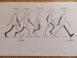
To improve upon my previous animation I
took guidance from other sources which gave clear instruction on how to
effectively mimic a walk cycle. By following diagram as illustrated below I
revised and reshot my walking split pin figure. To learn from my earlier errors
I also gave the figure a base on which to walk, because it adds context to the
animation so the figure no longer looks as if its moving in empty space.


No comments:
Post a Comment